A Matrix field is a design system, if you build it like one
The gap between a page builder your client enjoys and one they work around is about a dozen decisions, nearly all made in week one.

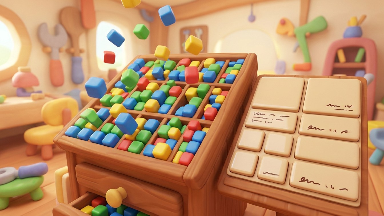
Every Craft build ends up with a Matrix field somewhere, and every Matrix field is a small design system whether or not anybody treated it as one.
The ones nobody treated as one are easy to spot: forty blocks, six of them nearly identical, names like Content Block 2 and New Section (final), and a client who has given up and started using the rich text block for everything, because at least they understand it.
That has nothing to do with skill. It comes from a dozen small decisions made in the first week, none of them big on their own, all of them compounding.
Name blocks after what they are, not what they contain
Two Column Image Text describes a layout. In a year, when the layout is redesigned to put the image above the text on smaller screens, the name is wrong and everyone has to remember to ignore it.
Feature describes a purpose, and survives a full redesign.
This sounds like pedantry until an editor is scrolling a dropdown at four o'clock trying to remember which of three similarly-named blocks is the one that renders correctly on the news template. Names are an interface, and the one people use most often.
Fewer blocks, more options inside them
The instinct when building is to create a block per design variation, because each one is simple in isolation. Six months later there are thirty blocks and nobody can find anything, including you.
The better shape is a smaller set of blocks with options inside them. One Feature block with an image-side setting beats Feature Left and Feature Right. One Card Grid with a column count beats three separate grids. One Callout with a tone option beats four coloured variants.
Fewer things to learn, fewer things to keep visually consistent, fewer templates to maintain, and fewer chances for two blocks to drift apart because somebody fixed a bug in one and not the other.
If two blocks differ only in where the image sits, they're one block and a setting.
Constrain the things that break the design
A page builder shouldn't be able to produce something the studio would refuse to sign off. That's the most useful rule here and the one most often skipped, because building constraints takes longer than not building them.
If the design has three heading sizes, the block offers three, rather than a free-text size field, a number input, or a rich text editor with the full range available. If cards work at two, three or four across, offer those three options. If the accent colour has two approved tints, those are the two in the dropdown.
This feels restrictive while you're building it and reads as care when somebody uses it. Nobody has ever thanked a developer for the freedom to set arbitrary margins, and plenty of clients have produced pages that made a studio wince.
Design the empty state and the extreme state
Every block will eventually be used with less content than intended and with a lot more. A card designed for a twelve-word description will get forty words. A grid designed for six items will get four, and then one.
Decide what happens in both cases while you're building rather than after launch. Usually it's simple (text truncates or the container grows, a four-item grid centres or left-aligns), but it's a decision, and an undecided one becomes whatever the CSS happened to do.
Write the help text as if you'll be on holiday
Every block gets one line of instruction, written for somebody who wasn't in any of the meetings and joined the client's team last week.
"Used for the three-up section on the homepage. Images crop to 4:3." It takes a minute to write and saves a support ticket every time a new person meets it. Over four years that's a lot of tickets, each one an interruption for someone at the studio.
The same goes for block descriptions in the picker. If a client is choosing between eight blocks, a sentence on what each is for turns a guess into a decision.
Order the picker by how often things get used
The block list shouldn't be alphabetical and it shouldn't be creation order. It should be roughly in order of frequency, with the things people reach for daily at the top.
It's a five-minute change at build time that saves a scroll on every use, for years.
When to break all of this
One-off pages exist. A campaign landing page that will run for six weeks and never be touched again doesn't need to be composable, and building it from the block library on principle wastes everyone's money.
Build it fixed, tell the client it's fixed, and move on. The system is for the pages that will live for years.
Why this is the real deliverable
Done properly, the studio doesn't hand over a set of pages. It hands over a kit: the studio's own components, in the client's hands, which can only be assembled into things the studio would approve of.
The site stops being a snapshot of a design and becomes a system that holds it. When the client needs a campaign page in month eight, they build it from the parts you designed rather than asking somebody to improvise, and it looks like their brand because nothing else was available.
That's a better thing to have sold, and it's the difference between a website that ages and one that doesn't.